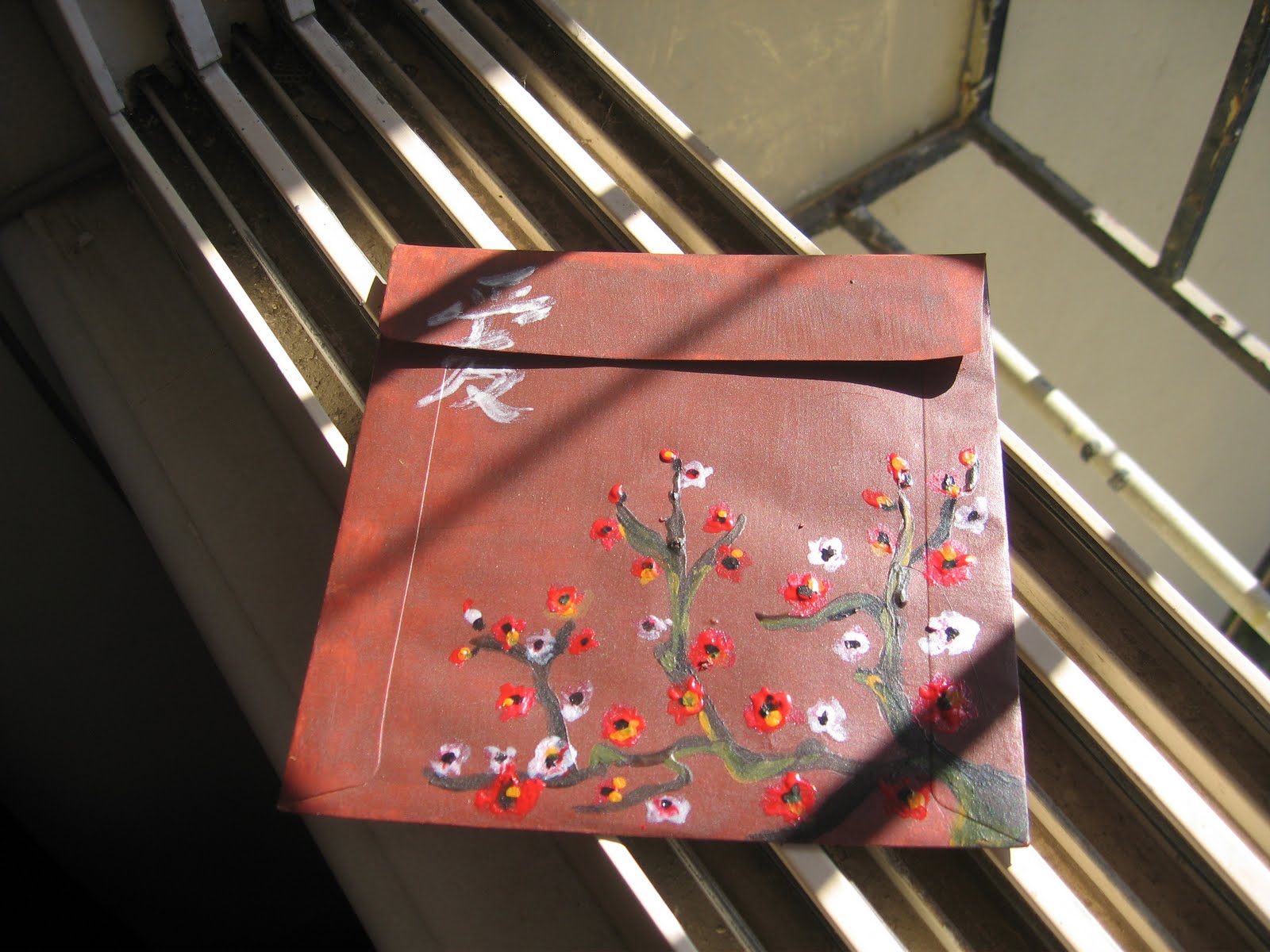
A month ago, I undertook a project to paint CD covers as an outlet for the stresses of things happening/not happening with Mrigya. The project turned out to be so much fun and was so fruitful that I thought I would write about it.
I have no idea how the thought of doing this project came to me. I basically saw these cute covers at Rightway Stationery (an insane local stationery store that has everything - their tagline should be 'we also do stationery') in 4 Bungalows and a box of acrylic paint next to them. Before my mind had an opportunity to question why - I had already paid for a dozen of the covers and the paints and was on my way to paint for the first time in almost 10 years!
I had never used acrylic paint before and had no idea how fast it dries! It was a fantastic experience and the best de-stress tool in the world as when I was painting, I had to react so quickly that I had absolutely no time to think about anything else. Another nice thing about acrylic was that I had no opportunity to draw anything so I had to directly paint which also made the work very spontaneous.
Since I was pasting the covers with the flap-side up, I also thought it interesting to paint utilizing the flap and the dynamics of having to open it or 'open the painting' in order to remove the CD inside. As you will see below, I have a very tentative start and then towards the end I really started taking risks with confidence. I have since sent all the covers out to people I thought of when I was painting them, but I did take some pictures around the house so I could remember them.
1. Royal Theme
The first CD cover was for a copy of the movie 'Ever After' and I decided to do something - 'royal' but also fantasy-like - so I used a very rich orange for the background and an elaborate 'kairi' design tinged with gold. I also thought that a picture with my 'royal' bull was fitting as the design is also ethnic.
You can tell that the background is a little patchy as I was still trying to figure out the consistency of the paint and how it dries. Though not perfect, I liked it as I was able to do a design over the flap. This was simple but a little tricky to paint directly without an outline as it needed to be very symmetrical to look good.
2. Fantasy Forest:

The second one is a fantasy forest theme. I was thinking about light filtering through a thick forest especially since I was reading Tad Williams' Shadowmarch where a shrouded mist keeps a fantastical and evil forest in shadow. ( Highly recommend the book for fantasy lovers as Tad outdoes himself in the depictions). It was challenging to mix colours seamlessly since they were drying so fast, so I decided to take a more 'rough' approach and it worked as I looked more to the texture of broad strokes rather than finesse.

My fantasy forest has a fantasy red tree which looked so good. I then embellished the tree with bright read nail polish to get a really gnarly texture and used my pearly nail-polish to give that brightness for the flower and the single star at the edge. I don't think dark forests with magical trees are necessarily a bad thing - but the added silver certainly completes the magic.
3. The Wedding Theme:
I was thinking about Aimee's wedding (Big shout-out Aimee-jee!) and how wonderful it was to be a part of it. I was not there for long, but the last 3 days before her wedding were wonderful with all that last minute planning and picking up favours and themes. The next two covers are boxes with wedding presents. The first one was easy with the classic black and white box and the huge bow. The second one I wanted to be more retro, hence the bright stripes. Also if you haven't noticed already - I was feel insanely corny, so almost every cover I painted has a 'heart' somewhere. Since this was for friends I love, I thought it fitting (and terribly corny, soap-oepra-y as well)

<-- Retro (I was thinking french!) Wedding box
<--Classic B&W Wedding Box
More in the next post!